Case Study

Case Study

Case Study

Case Study

Flipkart is one of India’s leading homegrown e-commerce marketplaces. It allows users to buy anything, from smartphones to fashion and daily groceries, all delivered right to their doorstep.

2 Weeks

2 Weeks

Duration

Duration

UX Design

UX Design

Role

Role

E-commerce

E-commerce

Industry

Industry

Problem Statement

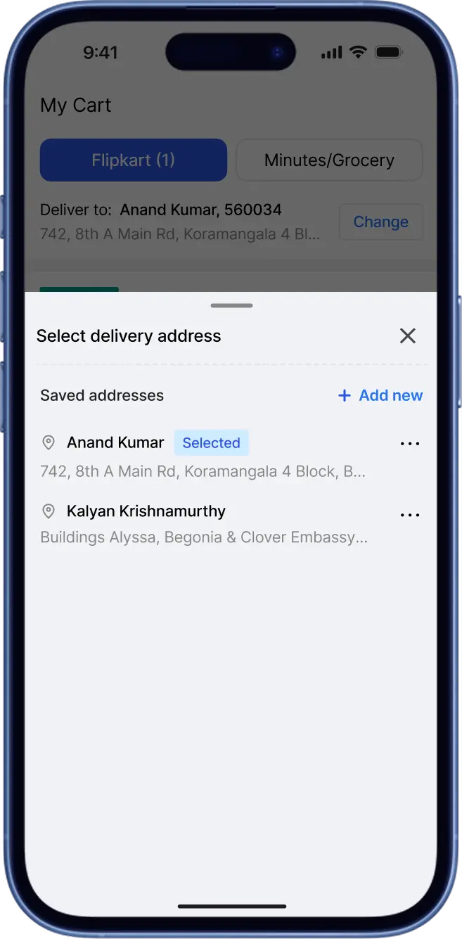
Users who wish to order something, at a new address, they are:

  • unable to add a new address directly from their cart section.

  • required to navigate back to the account settings to do the same.

Scope for Improvement

In order to ensure the purchase flow isn't disrupted, we need to:

  • create a feature that enable users to add new addresses directly from their cart.

  • ensure that users can quickly manage or switch between addresses.

THE BLOCKER

The actual cause that was leading to disruption in checkout through the cart.

THE BLOCKER

The actual cause that was leading to disruption in checkout through the cart.

THE BLOCKER

The actual cause that was leading to disruption in checkout through the cart.

Missing Control to

  • Add new address

  • Edit or fix errors in saved addresses

  • Delete outdated addresses

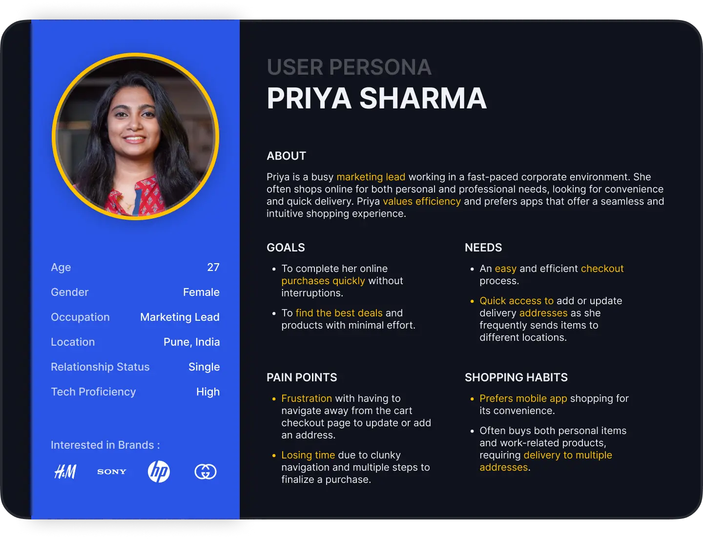
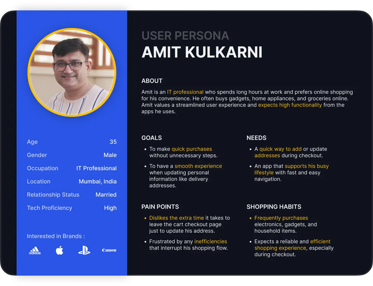
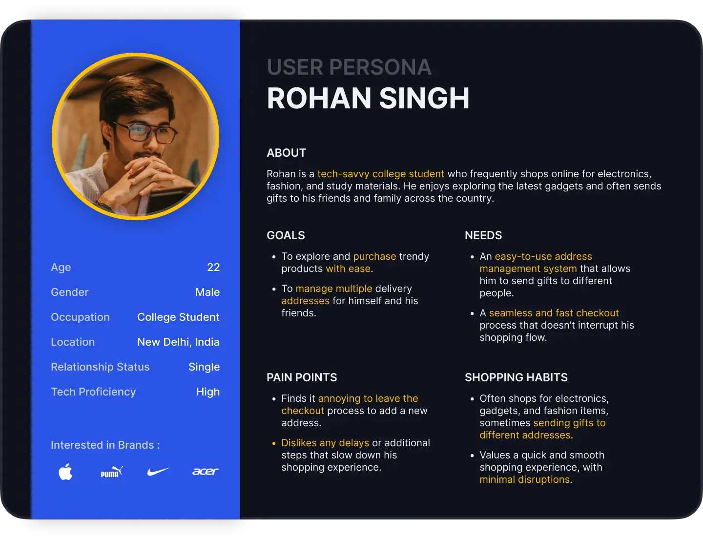
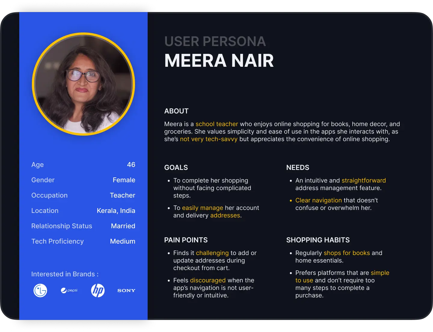
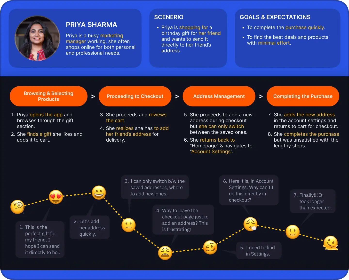
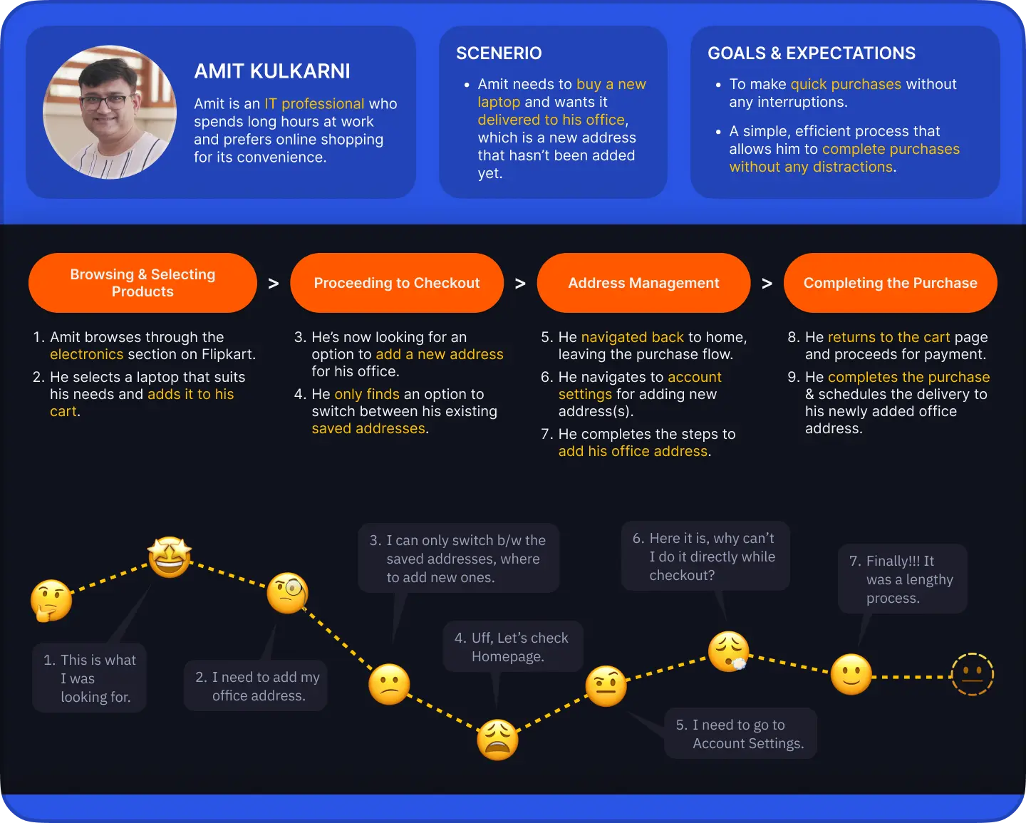
User Personas

UNDERSTANDING USERS

User Personas

UNDERSTANDING USERS

User Personas

UNDERSTANDING USERS

The Journey

WHAT USERS FELT?

The Journey

WHAT USERS FELT?

The Journey

WHAT USERS FELT?

VALIDATION

After working on this, I thought the problem wasn’t big enough. A year later, seeing Flipkart do the same confirmed I was in right track.

VALIDATION

After working on this, I thought the problem wasn’t big enough. A year later, seeing Flipkart do the same confirmed I was in right track.

VALIDATION

After working on this, I thought the problem wasn’t big enough. A year later, seeing Flipkart do the same confirmed I was in right track.

2024

Flipkart

2024

My Version

2025

Flipkart
My Learnings

  • Eliminating multi-step navigation to adding a new address showed how Hick’s Law speeds decisions by reducing choices and screens.

  • Analyzing checkout pain points showed small usability gaps can disrupt the entire purchasing journey.

  • Fixing navigation loops and enabling in-cart address management showed minimizing friction in conversion flows prevents drop-offs.

No Design is

No Design is

Perfect

Perfect

No Design is

No Design is

No Design is

Perfect

Therefore, Your feedback is valuable.
Up Next!

Up Next!

Up Next!

Up Next!

Up Next!

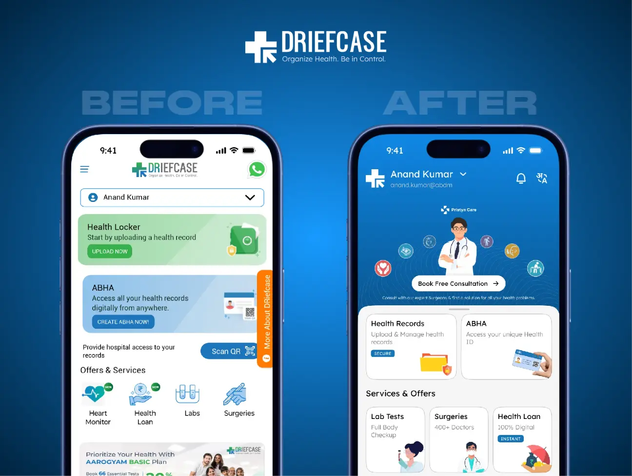
After

Before

After

Before

CASE STUDY

4 mins read

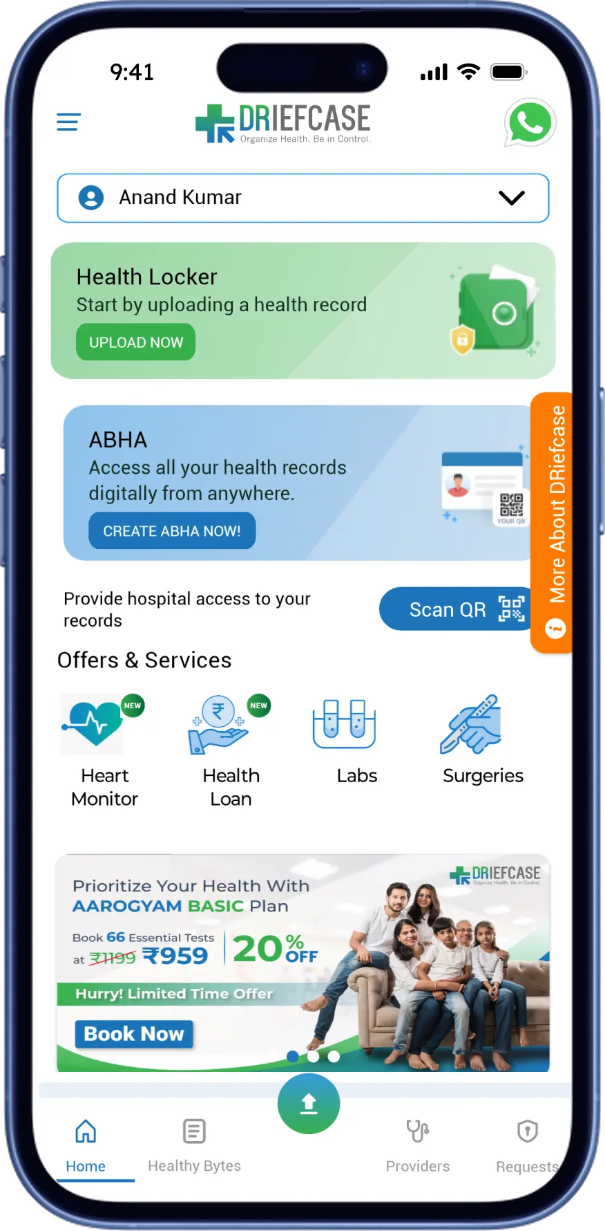
Driefcase Revamp

2025

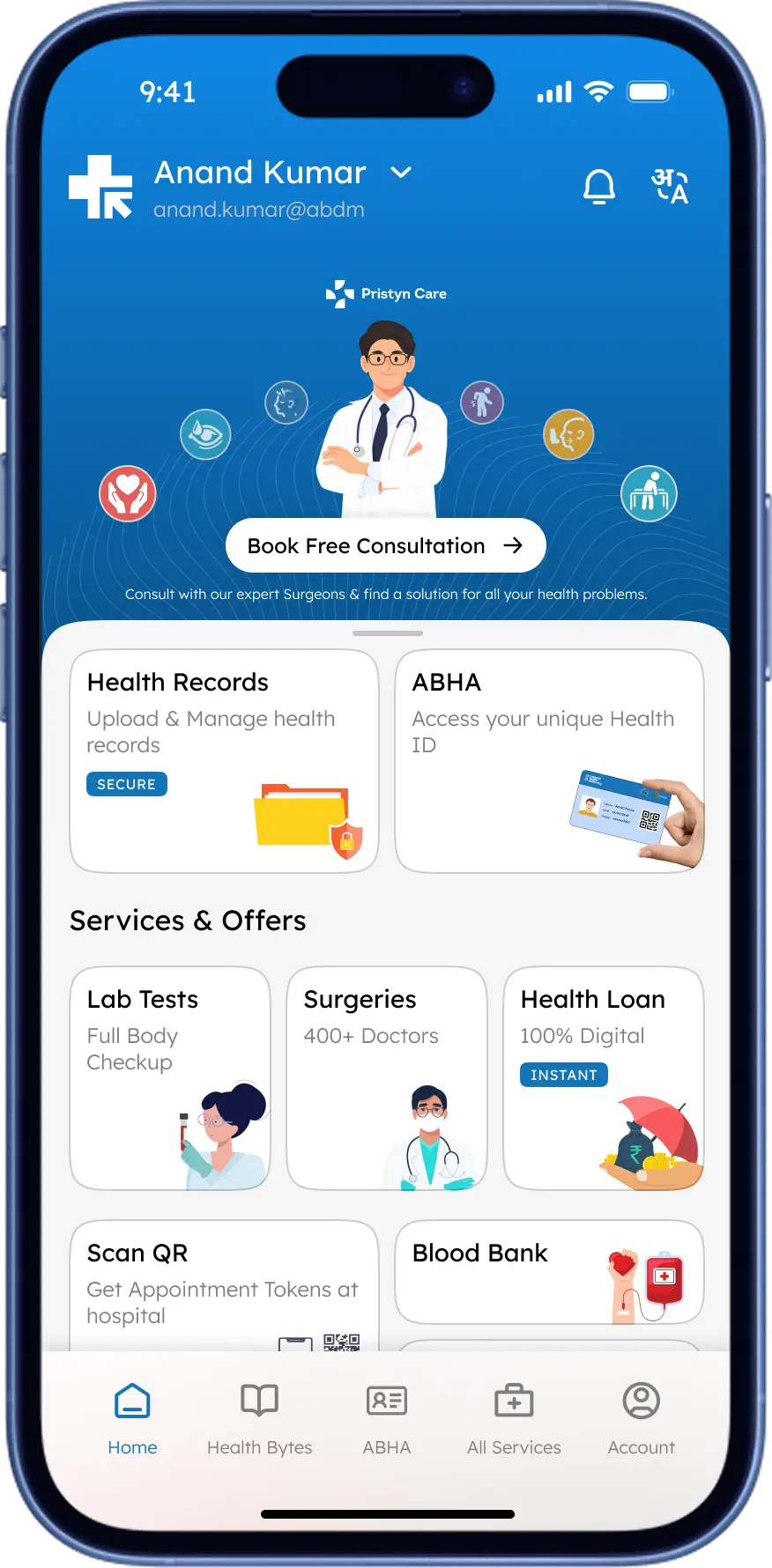
Transformation of Driefcase mobile app from a passive healthcare tool into an engaging, culturally-aligned healthcare management experience.

Thanks for scrolling!

Let's Create Something Great

Want to know about me?

Thanks for scrolling!

Let's Create Something Great

Want to know about me?

Thanks for scrolling!

Let's Create Something Great

Want to know about me?

Thanks for scrolling!

Let's Create Something Great

Want to know about me?

Create a free website with Framer, the website builder loved by startups, designers and agencies.