Redesign

Redesign

Case Study

Case Study

Redesign

Case Study

Redesign

Case Study

Driefcase is an ABDM-approved smart health document locker that securely stores, organizes, and shares personal and family medical records with ABHA integration.

Duration

Duration

24 Weeks

24 Weeks

Responsibility

UX & UI Design

UX & UI Design

Industry

Industry

Healthcare

Healthcare

Why Redesign?

These are some major UX issues that I feel needs attention:

  • Onboarding flow is overwhelming and is not user friendly.

  • The homepage reflects outdated 2015 UI Trends.

  • Most of the pages has major UX flaws.

  • App is not engaging & users tend to use it occasionally.

What can be improved?

These are some of the initial solutions that came into my mind:

  • Simplify onboarding and make it welcoming for users.

  • Reduce visual clutter with simple & concise layout.

  • Optimize critical UX issues across all pages.

  • Introduce features that helps in increasing user engagement.
Original Version

BEFORE REDESIGN

Original Version

BEFORE REDESIGN

Original Version

BEFORE REDESIGN

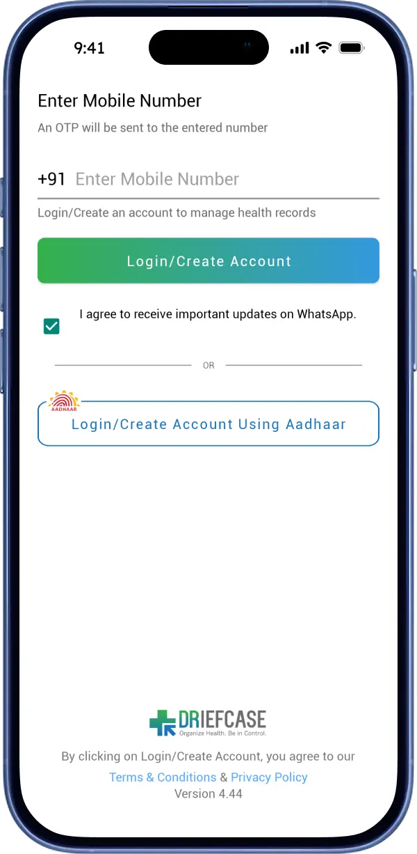
  1. Login & Register

  1. Registration

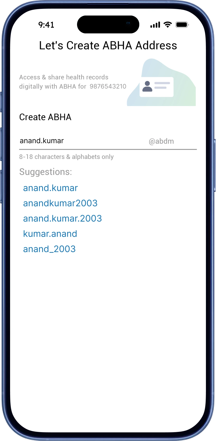
  1. Create ABHA

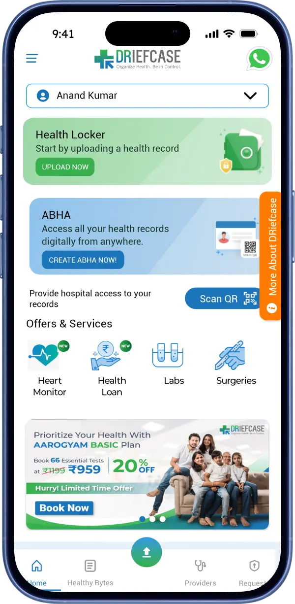
  1. Home Page

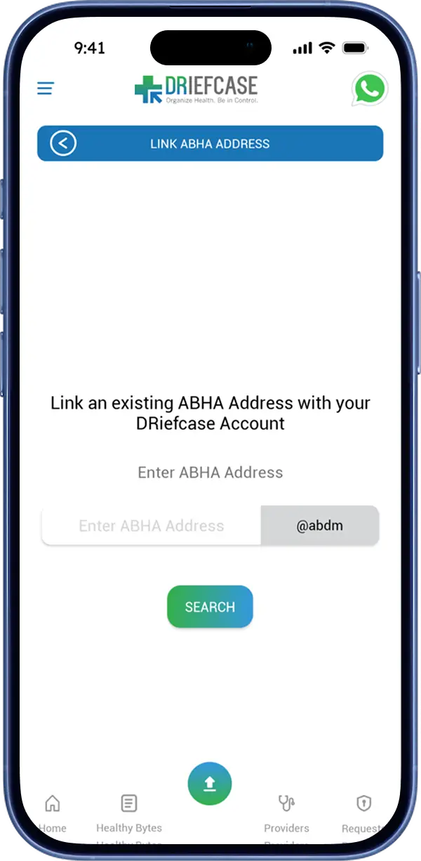
  1. Link ABHA

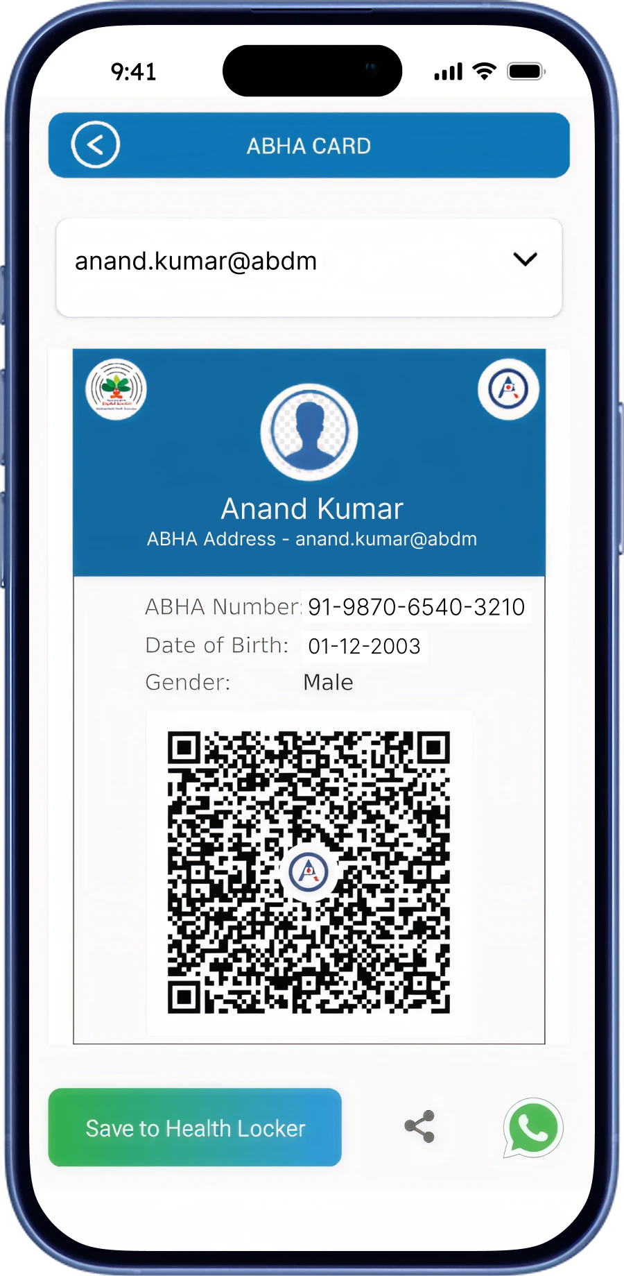
  1. ABHA Profile

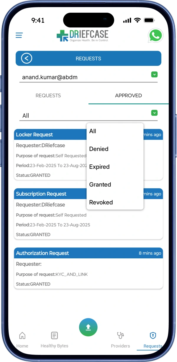
  1. ABHA Requests

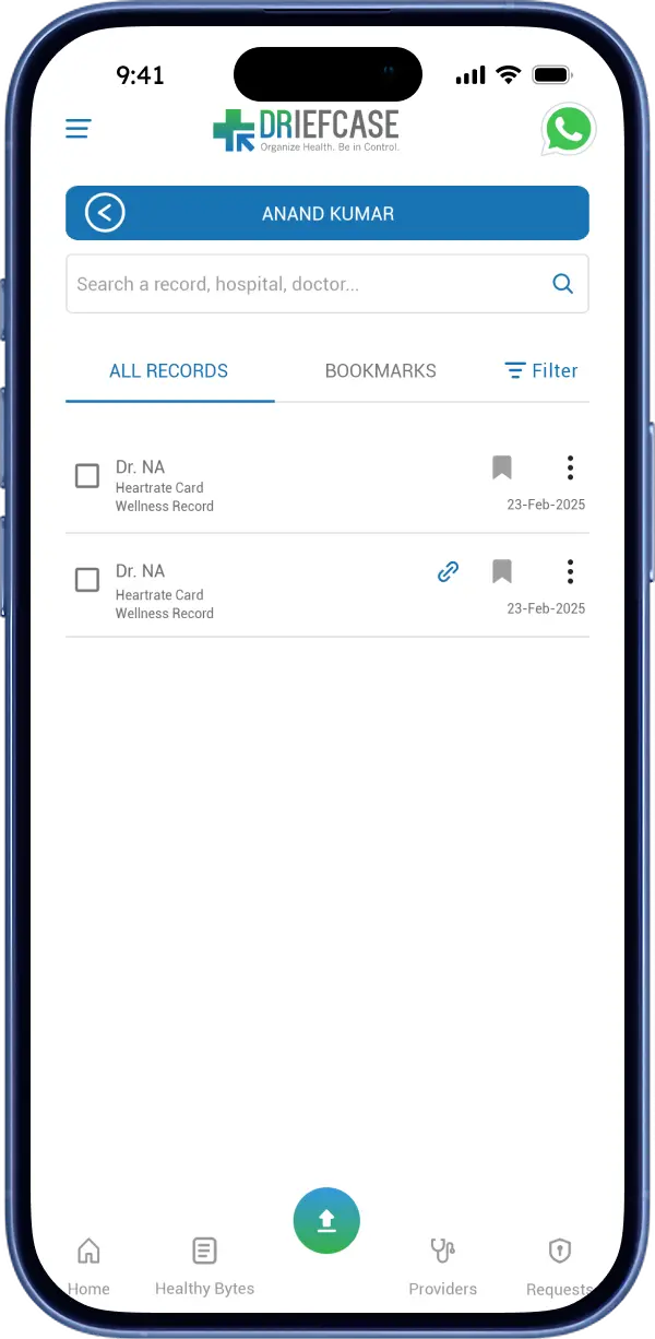
  1. Health Locker

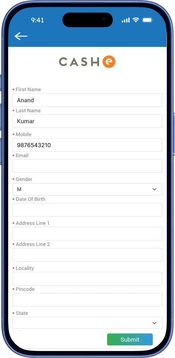
  1. Health Loan

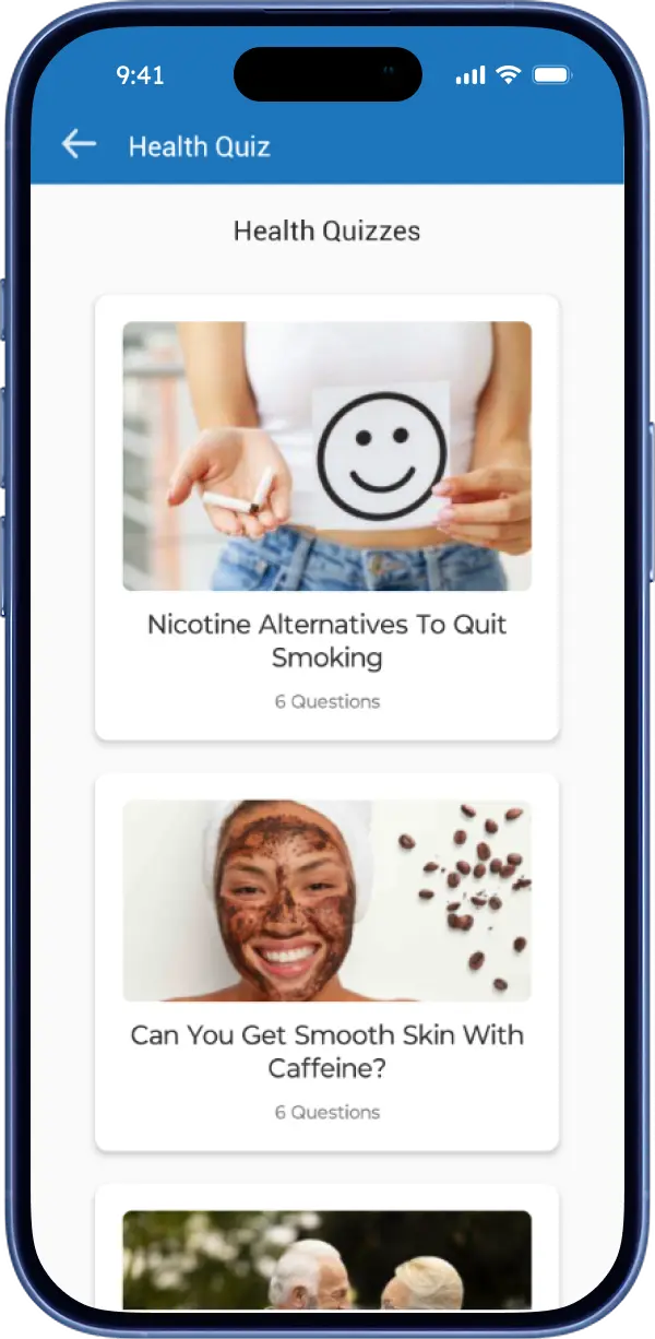
  1. Health Quiz

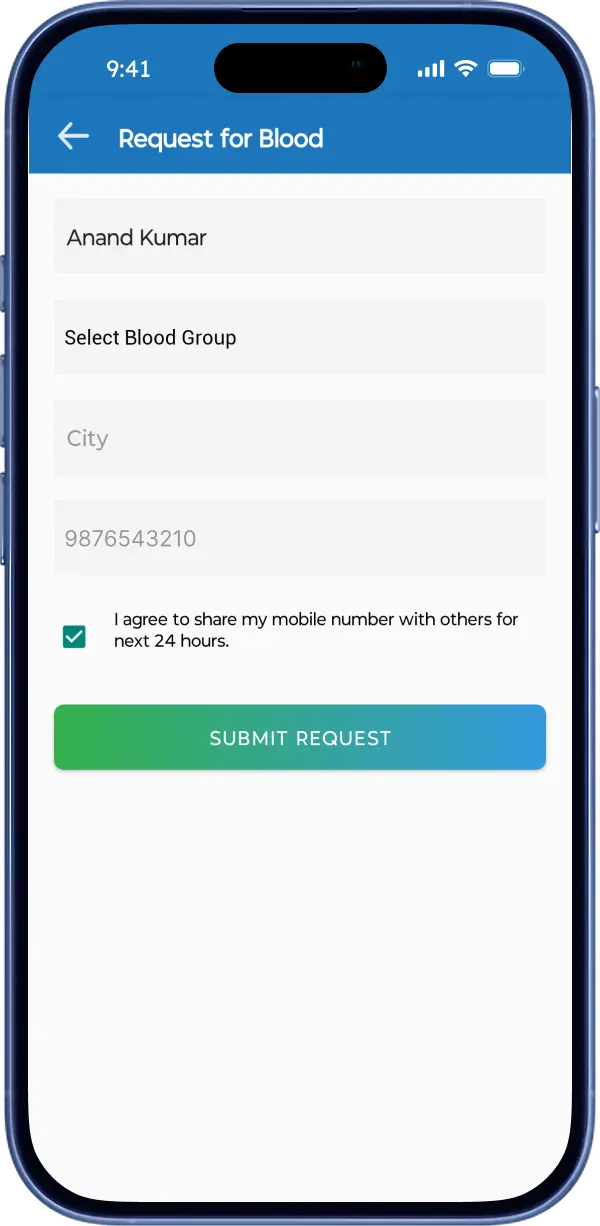
  1. Call For Blood

Overwhelming

  • Onboarding form adds up cognitive load.

  • Is not user-friendly.

Basic Date Picker is missing.

Insufficient space for Address.

Existing ABHA holders can't

  • skip this step.

  • link their existing ABHA ID.

Drop-off Point

  1. Either create a duplicate ABHA ID.

or

  1. Leave the app.

Cluttered Layout

  • Lacks a clear hierarchy.

  • Mixed layouts types.

  • Builds cognitive load.

Misleading Button

  • Not relevant to this page.

  • Creates confusion.

Limited Options

  • Only 1 way to retrieve ABHA.

  • Creates hindrance if forgotten.

Potential Merger

Poor Visual Hierarchy

  • All text blends together.

  • Statuses look identical.

  • Lacks clarity.

  • Harder to scan quickly.

Incorrect Grouping

  • "Approved" doesn't mean approved.

  • "Requests" section refers to pending requests.

Lacks Clarity

  • All categories seems identical for scanning.

  • Not optimized for quick scanning.

Doesn't authenticate users via Aadhaar or any other govt. body.

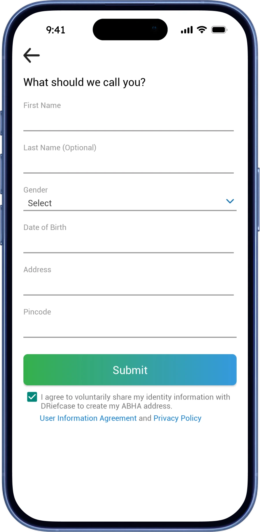
Overwhelming Form

  • Asking all at once.

  • Makes users feel tired.

  • Increases drop-off rates.

Missing Date Picker.

No visible CTA.

Less Motivating

  • Non-discoverable.

  • No incentives to participate.

  • No real impact.

Poor Discoverability

  • No urgent assistance.

  • No real-time blood availability.

  • Can't find nearby centers or blood banks.

  • Lacks transparency.

  1. Login & Register

  1. Registration

  1. Create ABHA

  1. Home Page

  1. Link ABHA

  1. ABHA Profile

  1. ABHA Requests

  1. Health Locker

  1. Health Loan

  1. Health Quiz

  1. Call For Blood

Overwhelming

  • Onboarding form adds up cognitive load.

  • Is not user-friendly.

Basic Date Picker is missing.

Insufficient space for Address.

Existing ABHA holders can't

  • skip this step.

  • link their existing ABHA ID.

Drop-off Point

  1. Either create a duplicate ABHA ID.

or

  1. Leave the app.

Cluttered Layout

  • Lacks a clear hierarchy.

  • Mixed layouts types.

  • Builds cognitive load.

Misleading Button

  • Not relevant to this page.

  • Creates confusion.

Limited Options

  • Only 1 way to retrieve ABHA.

  • Creates hindrance if forgotten.

Potential Merger

Poor Visual Hierarchy

  • All text blends together.

  • Statuses look identical.

  • Lacks clarity.

  • Harder to scan quickly.

Incorrect Grouping

  • "Approved" doesn't mean approved.

  • "Requests" section refers to pending requests.

Lacks Clarity

  • All categories seems identical for scanning.

  • Not optimized for quick scanning.

Doesn't authenticate users via Aadhaar or any other govt. body.

Overwhelming Form

  • Asking all at once.

  • Makes users feel tired.

  • Increases drop-off rates.

Missing Date Picker.

No visible CTA.

Less Motivating

  • Non-discoverable.

  • No incentives to participate.

  • No real impact.

Poor Discoverability

  • No urgent assistance.

  • No real-time blood availability.

  • Can't find nearby centers or blood banks.

  • Lacks transparency.

RATINGS & REVIEWS

WHAT USERS FEEL?

I reviewed 200+ negative Google Play reviews to understand common pain points among users.

RATINGS & REVIEWS

WHAT USERS FEEL?

I reviewed 200+ negative Google Play reviews to understand common pain points among users.

RATINGS & REVIEWS

WHAT USERS FEEL?

I reviewed 200+ negative Google Play reviews to understand common pain points among users.

  • Ananth Raj Kumar15 Apr, 2023

    It's very evident that the positive reviews are fake or paid. The app is just clutter. I'd rather use Google drive which is simpler and easier to use.

  • SINGHRAJ16 Mar, 2024

    Complex process.. better create a briefing video about the app for new users.

  • Yatharth Rai28 Mar, 2025

    Heart beat measurement not work property even any red object living or non living gives same result.

  • Ananth Raj Kumar15 Apr, 2023

    It's very evident that the positive reviews are fake or paid. The app is just clutter. I'd rather use Google drive which is simpler and easier to use.

  • SINGHRAJ16 Mar, 2024

    Complex process.. better create a briefing video about the app for new users.

  • Yatharth Rai28 Mar, 2025

    Heart beat measurement not work property even any red object living or non living gives same result.

  • Harsh Sharma5 Feb, 2024

    Very bad app not able to add a new member in my profile tried many times 😡

  • Redji4 Jan, 2024

    The application is way confusing and hard to navigate.

  • Kavyansh Raj7 Oct, 2023

    Very bad not a user friendly app 😂. Looks like every option takes you on creating unnecessary new lD again and again.

  • Harsh Sharma5 Feb, 2024

    Very bad app not able to add a new member in my profile tried many times 😡

  • Redji4 Jan, 2024

    The application is way confusing and hard to navigate.

  • Kavyansh Raj7 Oct, 2023

    Very bad not a user friendly app 😂. Looks like every option takes you on creating unnecessary new lD again and again.

Guerrilla Usability Testing

REAL-WORLD TRIALS

I conducted a small-scale usability test to study the experiences of first-time users.

Guerrilla Usability Testing

REAL-WORLD TRIALS

I conducted a small-scale usability test to study the experiences of first-time users.

Guerrilla Usability Testing

REAL-WORLD TRIALS

I conducted a small-scale usability test to study the experiences of first-time users.

8

8

Participants

18-45

18-45

Age Group

Android & iOS

Android & iOS

Platform

User
U1
U2
U3
U4
U5
U6
U7
U8
Create an Account
Create an Account
Add a New Member
Add a New Member
Add a Document
Add a Document
Book a Lab Test
Book a Lab Test
Apply Health Loan
Apply Health Loan
Check Blood Availability
!?✔
✔
!?✔
!?✔
✖
✖
✔
!?✔
✔
✖
!?✔
!?✔
!?✔
✔
✔
!?✔
!?✔
✖
✖
✔
!?✔
✖
!?✔
✖
✔
✔
✔
✖
✖
✔
✖
!?✔
!?✔
✔
!?✔
✖
✖
✔
!?✔
✖
!?✔
!?✔
✔
!?✔
!?✔
!?✔
✖
!?✔

✔

User can perform task quickly, without any trouble.

!?✔

User can perform task, but has some struggles.

✖

User can't perform task.

Key Insights

The following data represents the outcomes of Guerrilla Usability Testing.

38%25%38%

Create an Account

3 of 8 users were unable to create their account.

63%38%

Add a New Member

3 of 8 users struggled while adding a new member.

38%63%

Add a Document

5 of 8 users struggled while adding or uploading documents in Health Locker.

13%38%50%

Book a Lab Test

4 of 8 users were not convinced to choose among several test packages.

63%38%

Apply for Health Loan

3 of 8 users did not fill out the loan form or abandoned it in-between.

13%38%50%

Check Blood Availability

4 of 8 users were unable to get details about nearby blood availability.

Onboarding

There is no option to link existing ABHA ID while onboarding.

Lab Test

Multiple packages are shown, all at once.

Users having difficulty deciding a suitable.

Health Loan

Users seems to be overwhelmed with the lengthy form.

Many users dropped off the form midway.

Health Loan

Those who applied are unable to track their application status.

Blood Availability

Users can't check for real-time blood stock.

Users are waiting for response after raising a request.

Top 3 Problems

Here are the top three big issues spotted during the usability testing.

  1. Missing onboarding flow for users with existing ABHA ID.

  1. Forms are overwhelming & time-consuming.

  1. No real-time data on blood request & availability.

Final Design

Final Screens

Final Screens

Final Design

Final Screens

Single Screen Comparision

BEFORE & AFTER

Single Screen Comparision

BEFORE & AFTER

Single Screen Comparision

BEFORE & AFTER

Experimental

Experimental

Experimental

Experimental

Experimental

Health Quiz

GAMIFICATION

Health Quiz

GAMIFICATION

Health Quiz

GAMIFICATION

Gem-based Reward System

The primary goal of this feature is to increase general health literacy & awareness among users. It focuses on incentivizing continuous learning with rewards like Discount Coupons, Gift Cards & Exclusive Health Benefits which will potentially increase user retention.

Information Architecture

Home

Health Quiz

Live Quizzes

Already Played

Quiz Window

Quiz Results

My Rewards

Reward Store

Gems Wallet

Intro Drawer

Screen

Pop-Up

Action

Higher Level = Bigger Rewards

This is highly effective progression-based reward loop, often called a "loyalty loop". As users achieve higher levels, higher the reward becomes.
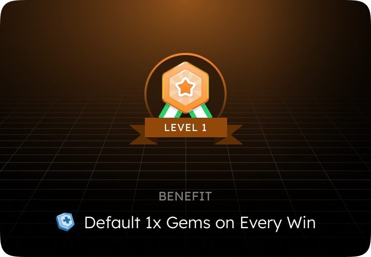
Level 1
Level 2
Level 3
Level 4
Level 5
Wins Required
-
3 Wins (in Level 1)
15 Wins (in Level 2)
40 Wins (in Level 3)
100 Wins (in Level 4)
Gems
1x
1.25x
1.5x
2x
4x

Why This Can Work?

  1. Escalating Endorphins: Fixed rewards eventually become boring (e.g., getting 10 gems every time). Increasing rewards match with the user's time & efforts making the heavy grind feel fair and highly lucrative.

  1. Sunk Cost Effect: The more time & effort a user invests into reaching a higher level, the less likely they tend to abandon the progress. They don't want to waste the high-earning status they earned.

My Learnings

  • Reducing clutter and prioritizing simple flow taught me that reducing cognitive load matters more than aesthetics.

  • Analyzing 200+ raw user reviews taught me how to filter noise and translate real user frustration into precise & prioritized solutions.

  • The broken ABHA ID onboarding proved that neglecting edge cases can entirely halt a whole user flow & can ruin user retention.

No Design is

No Design is

Perfect

Perfect

No Design is

No Design is

No Design is

Perfect

Therefore, Your feedback is valuable.

Up Next!

Up Next!

Up Next!

Up Next!

Up Next!

After

Before

After

Before

MINI CASE STUDY

1 min read

Flipkart

2024

This case study addresses a minor yet significant UX issue that potentially led to interruptions during checkout via cart for new addresses.

This case study addresses a minor yet significant UX issue that potentially led to interruptions during checkout via cart for new addresses.

Thanks for scrolling!

Let's Create Something Great

Want to know about me?

Thanks for scrolling!

Let's Create Something Great

Want to know about me?

Thanks for scrolling!

Let's Create Something Great

Want to know about me?

Thanks for scrolling!

Let's Create Something Great

Want to know about me?

Create a free website with Framer, the website builder loved by startups, designers and agencies.